Since 2017, when both the Rams and Chargers have been in L.A., the Rams have done basically everything right while the Bolts have been … well, the Bolts, making just about every bad public relations decision possible. But the Chargers may have finally done something better than their landlords.
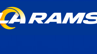
The Rams have a new logo that their fan base is outright revolting against.
“We don’t think they put enough thought into it and the fact they didn’t give us an opportunity to even talk about it before they made the decision for the fans, and without fans you don’t have sports franchises,” said Rams fan Thomas Avants.
The logo is so bad that a petition has begun urging the organization to change it. Nearly 10,000 people have already signed. The reasons for disliking the new logo are plentiful.
“It’s way too basic,” said Avants. “When you’re a billion dollar organization and you put that much time and effort into it and you’re supposed to have the best graphic designers and you’re bringing in the best people to do this and you put that out and 10 minutes later you’ve got fans … and a lot of my buddies on Twitter did it … taking their logos and combining them together, sprucing them up. When we can do that in 10 minutes it makes the franchise look bad.”
Rams Hall of Fame running back Eric Dickerson even got involved, offering to take one of the fan-made logos straight to the front office.
There is a section of Rams fans who are OK with the new look.
“I like that it has L.A. in it,” said Rams fan Adam Pendleton. “For a few years now I’ve heard whispers that the new logo was going to have L.A. in it and being an L.A. guy I kind of was looking forward to that. I was happy that it was a nod to our old colors. Logo aside I was happy they got the colors right.”
Local
There is one thing, however, that people who both like and loathe the new Rams logo agree on.
“It looks more like the Chargers. Like, that’s what it is. It looks like a C instead of a ram horn,” said Rams fan Joe Ramirez.
And there’s the biggest contention.
“I would be amazed if they didn’t see that before they put that out. That has to be the one thing I would change,” said Pendleton.
“I think a lot of Rams fans, and it really kind of bugs me, because the Chargers are now in our town sharing a stadium with us, they get really bent out of shape about it,” said Avants. “I don’t really put too much stock in it to be honest with you.”
The reason for that is fairly simple. Just about every fan of the Los Angeles Rams agrees the Chargers belong in San Diego where their true fan base is.
“There has grown a rivalry, I would say, between Chargers and Rams … I don’t want to say fans because the Chargers are low on fans,” said Pendleton.
The Rams organization also has new uniforms but they’re choosing to unveil their updated look a few pieces at a time. After seeing the logo many Rams fans don’t have much faith that the uniforms will be any better.
“The most concerning thing here,” said Rams fan Tyler Bearde, “is the Rams organization is telling everyone, ‘Just wait till you see the uniforms. Then everything will make sense in relation to the logo.’ Well if that’s the case then I can say with absolute certainty Rams fans are going to hate the new uniforms and helmets. The fans asked for just a simple update to the classic throwbacks. I don’t remember hearing a single fan asking for a complete overhaul of the brand! If the new uniforms are as radical as what’s being suggested (based on the logos), then the Rams organization are literally going to piss off a majority of their old school Los Angeles Rams fans, who were the most instrumental in helping the team return to Los Angeles.”
Part of the Rams explanation of the logo is usage of the golden ratio, also known as the Fibonacci Sequence. That seems like a bit of overthinking for professional football fans but Pendleton sees the franchise looking at the long play here.
“This logo is speaking to kids that are not on Twitter right now. So yes, sometimes I think they overthink it with the Fibonacci Sequence and all this stuff but they are definitely trying to speak to a younger crowd.”
One more part of this that has Rams fans scratching their heads is the design of the new stadium looks an awful lot like the logo the team was just using.
“That’s the funniest part,” said Avants. “They literally, and they can say they didn’t but give me a break man. We’ve all seen superimposed that St. Louis logo on there and they decided to shape the stadium in that logo. If you’re going to spend that many billions of dollars to shape it like the old logo then why would you change it in the first place? That’s insane.”
For what it’s worth, the Chargers new look is getting solid reviews.
Too bad there won’t be many people in the stands at the new stadium to see it.


